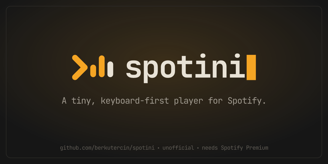
Brand basics for spotini, a tiny, keyboard-first player for Spotify. Everything here is generated by
npm run brand from brand/build.mjs, so edit the script, not the files.
Logo
Three pieces: the mark (a prompt and an equalizer), the wordmark (spotini with a block cursor), and the lockup (both side by side). The app icon is the mark on its charcoal tile. Use the dark versions on dark backgrounds and the light versions on light ones; the light versions use a deeper amber that stays readable on paper.
App icon
The mark on its tile, as it appears in the taskbar, tray and installer. Don't go below 16 px.



Clear space and size
Keep empty space around the logo at least as wide as one bar of the mark on every side. Don't set the lockup smaller than 96 px wide or the mark smaller than 16 px tall.

Colour
Charcoal and warm off-white with one accent, amber. Amber is for the mark, the cursor and one thing per screen that matters most; it's never a background for long text.
Type
One family: JetBrains Mono (SIL Open Font License). Bold for the wordmark and headings, regular for everything else. Tight tracking (−0.04 em) on large text.
Name and voice
Always spotini, lowercase, even at the start of a sentence. The tagline is "A tiny, keyboard-first player for Spotify." Say "player for Spotify", never "Spotify player": spotini is unofficial and not affiliated with Spotify, and anything public should say so.
do
- use the files from
brand/logoas they are - pick the dark or light version to match the background
- keep the cursor amber, or everything one colour
- say "unofficial" and "needs Spotify Premium"
don't
- stretch, rotate, outline or add shadows to the logo
- use Spotify's green, logo or wording that implies it's theirs
- put the mark on busy photos without its tile
- capitalise it as "Spotini" or "SPOTINI"
Social and favicon
The link preview image (1280×640) and the favicon.